Posted on 04 May 2022, by Kevin Mora
There is a place where subjective artistic design in data visualization makes deliberate design choices to achieve a form. Like it or not, I think that part of the process should be utilized and leads us to think critically.
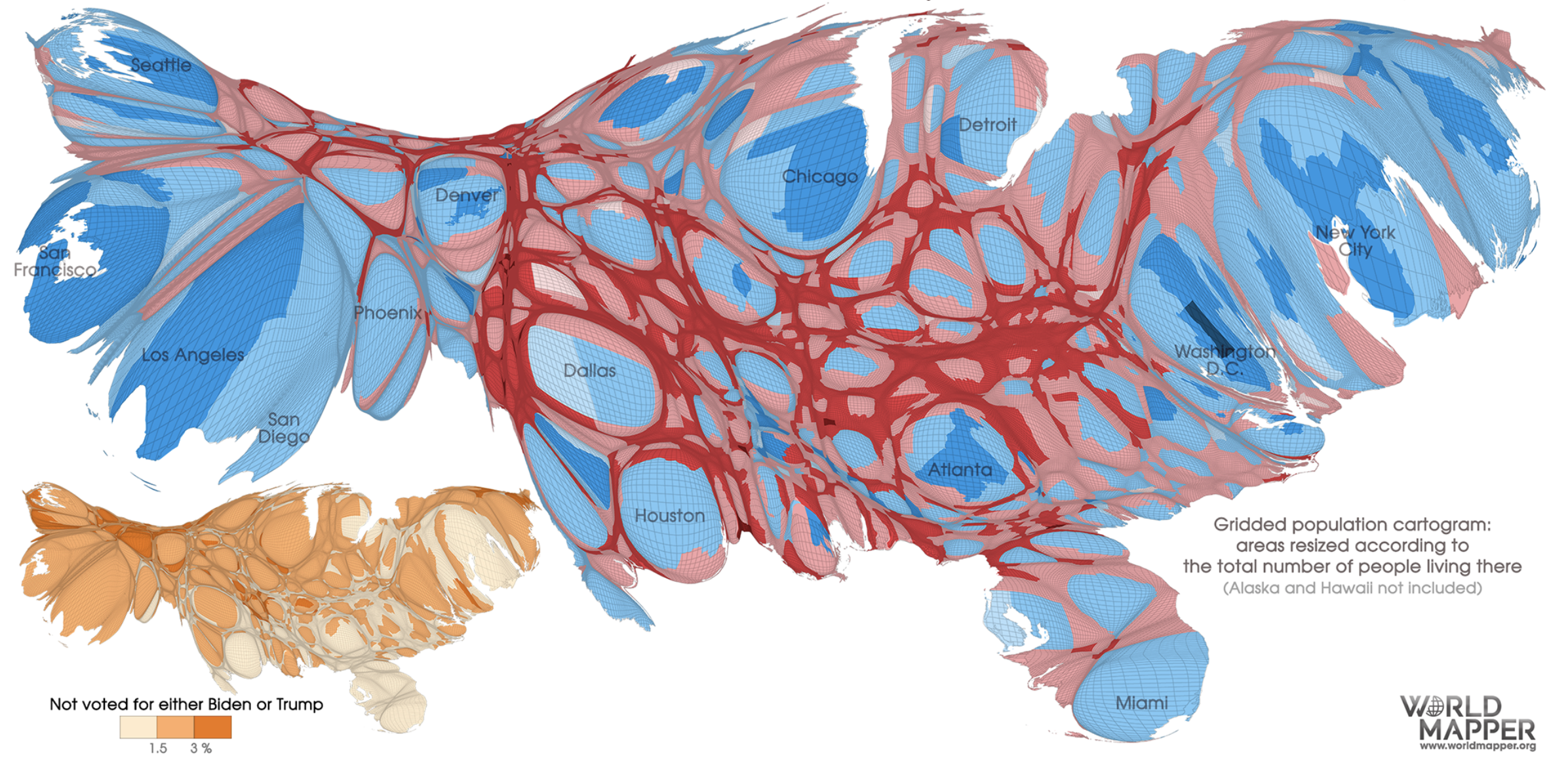
Today I came across this attempt to visualize the 2020 US Presidential Election, and I thought it was a very interesting and nouvelle approach – that being the reason, I would like to discuss the advantages and disadvantages of such attempt.

The implementation of the entire system, as well as the process of drawing district boundaries, varies considerably between districts. I think it's an excellent illustration of how presentation can be arbitrary and affect arbitrary interpretation. When I look at this illustration and contrast it with the clean version, I immediately assume that I'm not just comparing two different visualizations of the same dataset, but rather two distinct datasets. I would think that a different candidate triumphed in each presentation if I were given one or the other without knowing the outcome of the election, with Donald Trump coming out on top in the clear version, which is obviously false.
Should we even try to represent our data like this? Why should a region's size and its people be equated? This technique turns geography into a pseudo-label while still allowing it to affect the variable you're after – in this instance, population. The state maps' location, shape, or area have no connection whatsoever to the population or the election's result, other than the fact that they are used as a fancy label. Why on earth wouldn’t you just use two separate, clear graphs instead? Or, why not just create a hexagonal cartogram?
That being said, I think this rendering is fantastic and it portrays a lot of information a standard polling cartogram wouldn't be able to. Of course, explaining the situation and giving the audience a minute to get used to what they're seeing is necessary, but the correlation between metropolitan and rural parties fascinates me. The country's population hubs' proportional sizes and an understanding of the regional population hub clustering, as well as the degree of separation between them.
The effect that can be had with visualization can occasionally appear to be artificially diminished by an overly strong aversion to complexity. A well-meaning instructor once told me that your customers "should never have to think." Although I think it is a goal worth pursuing, looking back, I think it was a little wrong... Shouldn't our visualizations aim to provoke thought and discussion among our viewers? Scaling a region by its population is a straightforward idea that, in my opinion, is quite effective, even if the outcome is a bit bizarre. It stimulates your inventive thinking and prompts you to consider alternative ways of conveying this information.
I think there is a segment of the industry full of abstract thinkers and gorgeous modelers who only incorporate invisible data structures into computers. Then there is this opposing viewpoint that considers data science to be heliocentric information communication rather than computational truth-seeking in abstract domains, with the visualization for the end user being the Sun.